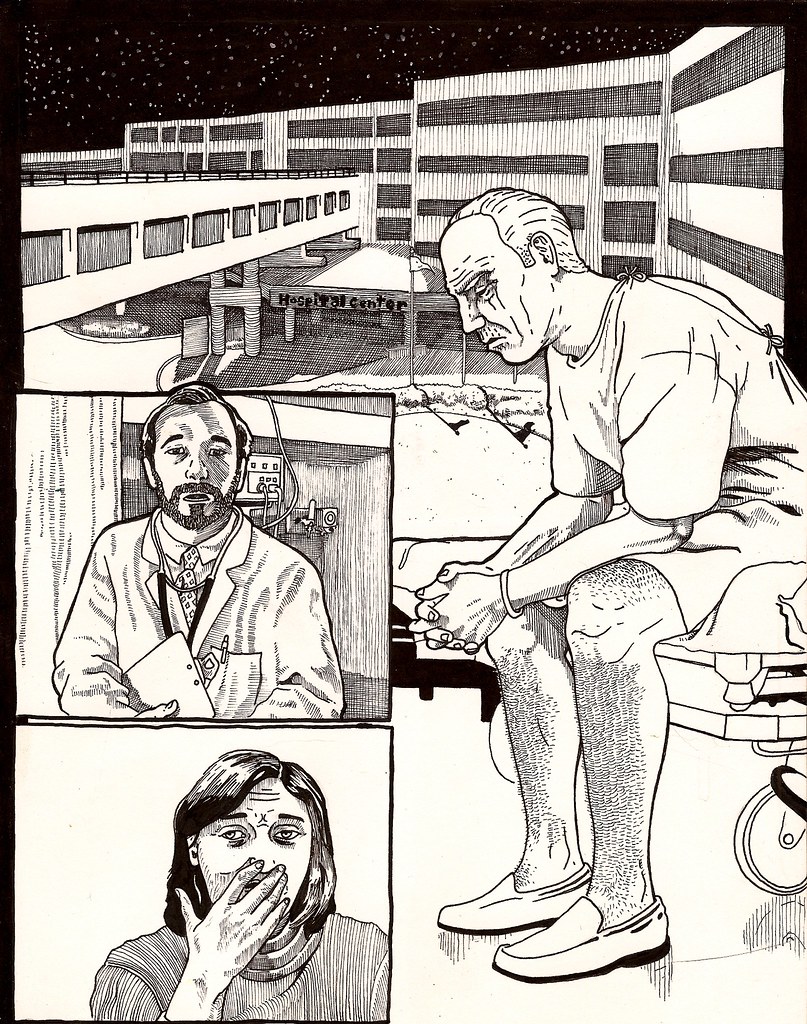
Wow, the environments in these panels look really tight. Especially the black and white trees! The only thing I'm noticing with these panels is that the character looks like he is "cut and pasted" into the environments. He looks flat and stands out a little too much. I think it mostly has to do with how you handled him as opposed to everything else (ie: direction of light/shadow, and the crosshatching on him but nowhere else really). Other than that they look great, nice sequencing.
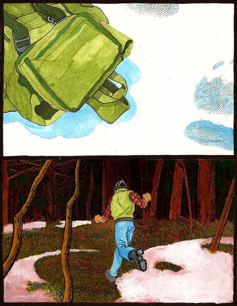
Dude, thanks for stopping by! I'm glad your digging that black and white page with the trees, its my personal favorite stylistically and coincidentally enough felt the most natural as I was doing it.
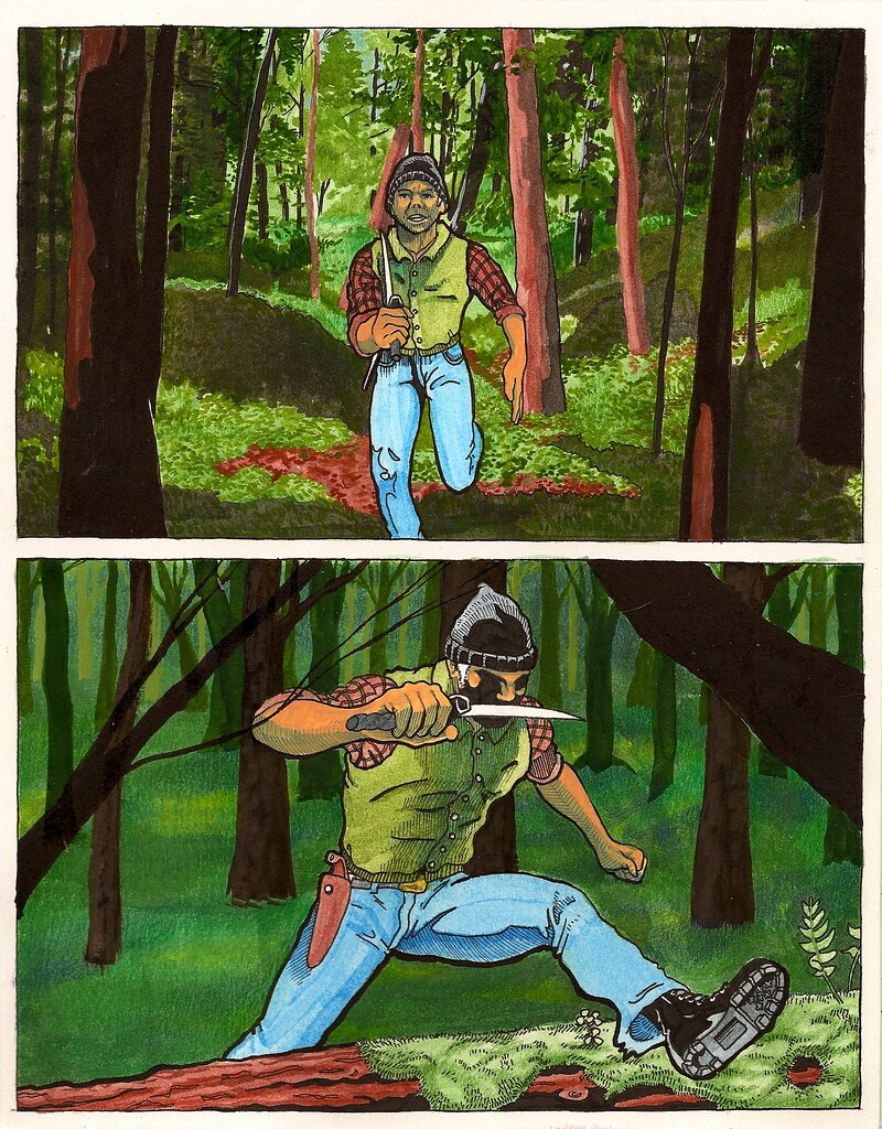
At the risk of sounding defensive (I'm not just explaining my thought process in hopes of further crit/convo) I know what you mean about the cut paste thing. I think a big part of it has to do with the heavy black outline on the character, which was a stylistic choice. My thought was that the main focus needed to be on the character and I was worried about him getting lost against my kind of overworked backgrounds.
So I attempted to adopt a trick of Joe Maduerias using heavy outlines on the character to pop them forward in space. Unfortunately though, and I do agree with you, I think it worked a little to well, and is probably too distracting if its the main thing bugging you about it.
Thanks for the feedback dude, I really appreciate it! Hope your finals are going well!
Yeah, I could see that. I don't know, maybe you could try being a little more selective in where exactly you place that bold line, instead of treating the whole figure with it.
Anyways, to beat a dead horse, your environments look really lush.


3 comments:
Wow, the environments in these panels look really tight. Especially the black and white trees! The only thing I'm noticing with these panels is that the character looks like he is "cut and pasted" into the environments. He looks flat and stands out a little too much. I think it mostly has to do with how you handled him as opposed to everything else (ie: direction of light/shadow, and the crosshatching on him but nowhere else really). Other than that they look great, nice sequencing.
Dude, thanks for stopping by! I'm glad your digging that black and white page with the trees, its my personal favorite stylistically and coincidentally enough felt the most natural as I was doing it.
At the risk of sounding defensive (I'm not just explaining my thought process in hopes of further crit/convo) I know what you mean about the cut paste thing. I think a big part of it has to do with the heavy black outline on the character, which was a stylistic choice. My thought was that the main focus needed to be on the character and I was worried about him getting lost against my kind of overworked backgrounds.
So I attempted to adopt a trick of Joe Maduerias using heavy outlines on the character to pop them forward in space. Unfortunately though, and I do agree with you, I think it worked a little to well, and is probably too distracting if its the main thing bugging you about it.
Thanks for the feedback dude, I really appreciate it!
Hope your finals are going well!
Yeah, I could see that. I don't know, maybe you could try being a little more selective in where exactly you place that bold line, instead of treating the whole figure with it.
Anyways, to beat a dead horse, your environments look really lush.
Keep it up dude!
Post a Comment